The problem at hand…
Rochester New York’s current city website is outdated. It is hard to navigate and presents information unclearly.
Rochester New York’s current city website
Research findings
I interviewed a current Rochester Resident to determine a user flow. Here are my findings:
-
The current website is very unorganized. It is very hard to find information quickly and efficiently without really searching. The navigation bar doesn’t help the user navigate through the site and it is almost hidden at the top, very hard to access.
-
The website is very text heavy. Information & events are not communicated very well. Users should be able to do a quick scan to access information on the homepage with very little to no reading. Incorporate more images and allow active engagement throughout the site.
-
Many people are unaware of things to do in Rochester. It was apparent that users would like to have some background and learn about the history of the city.
Work Process
Wireframes
At first I wanted to stick to a government like layout but also wanted to be experimental with different sections and how I wanted to layout information.
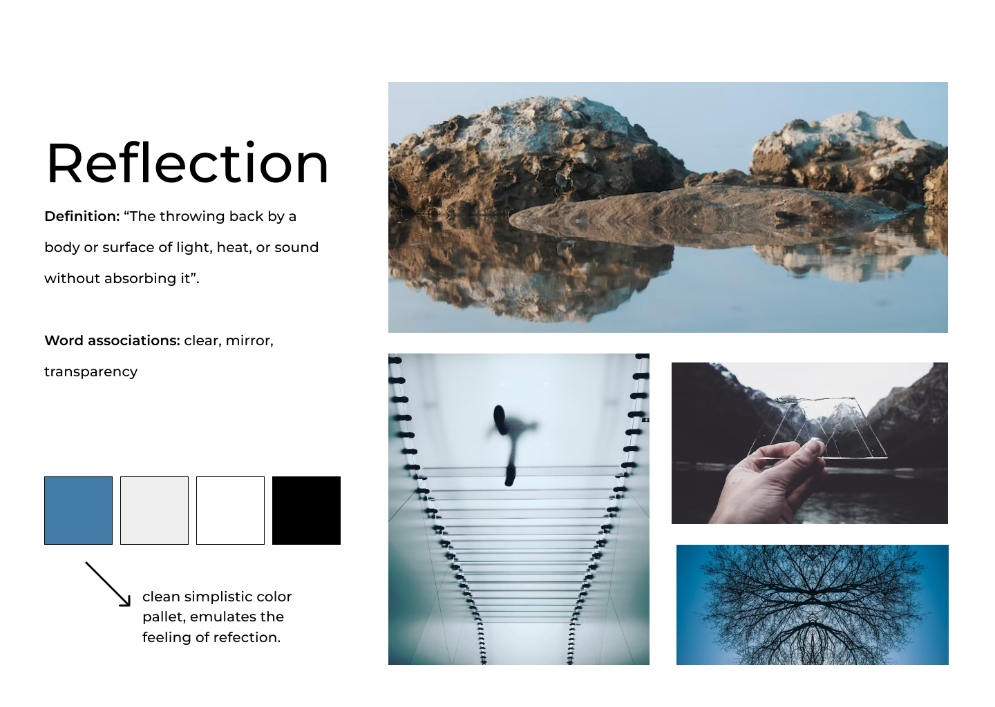
Style/Mood boards
I had a lot of fun exploring different possibilities for style. I decided to have two contradicting mood boards that we could use as inspiration.
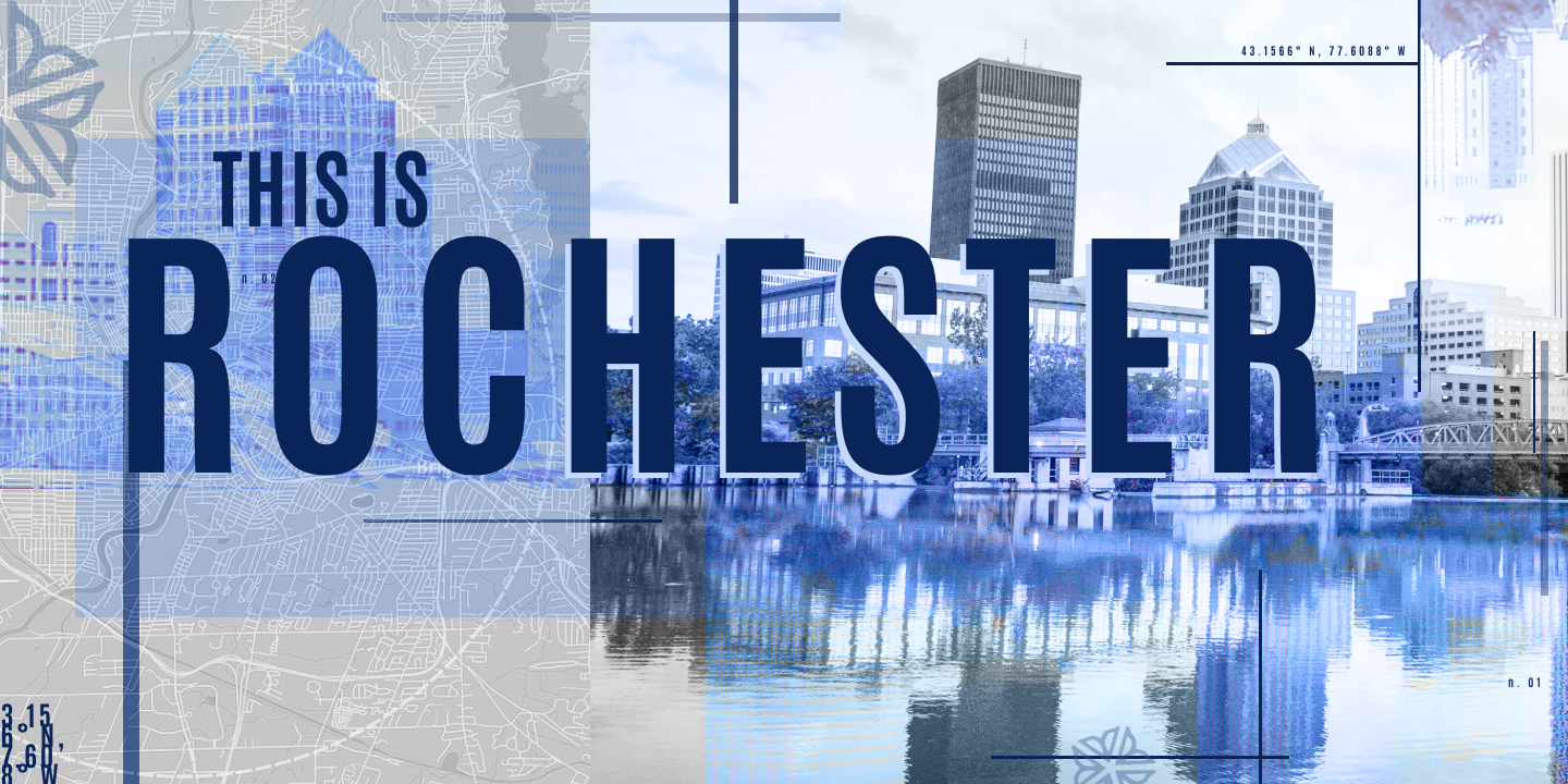
Above the folds
Creating a hero image was a challenge for me, but through a lot of iterations I was able to come up with a style that emulated the style of reflection.
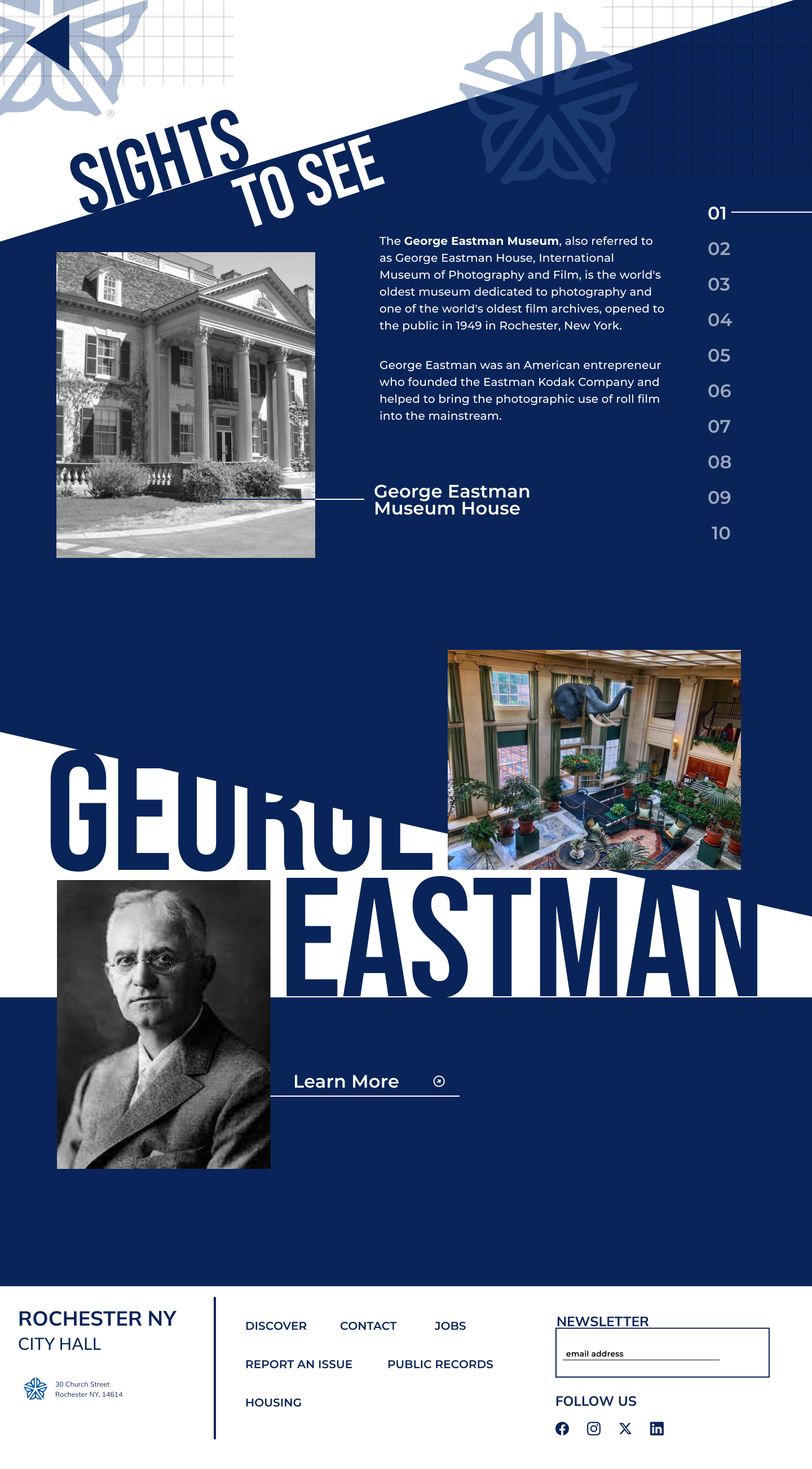
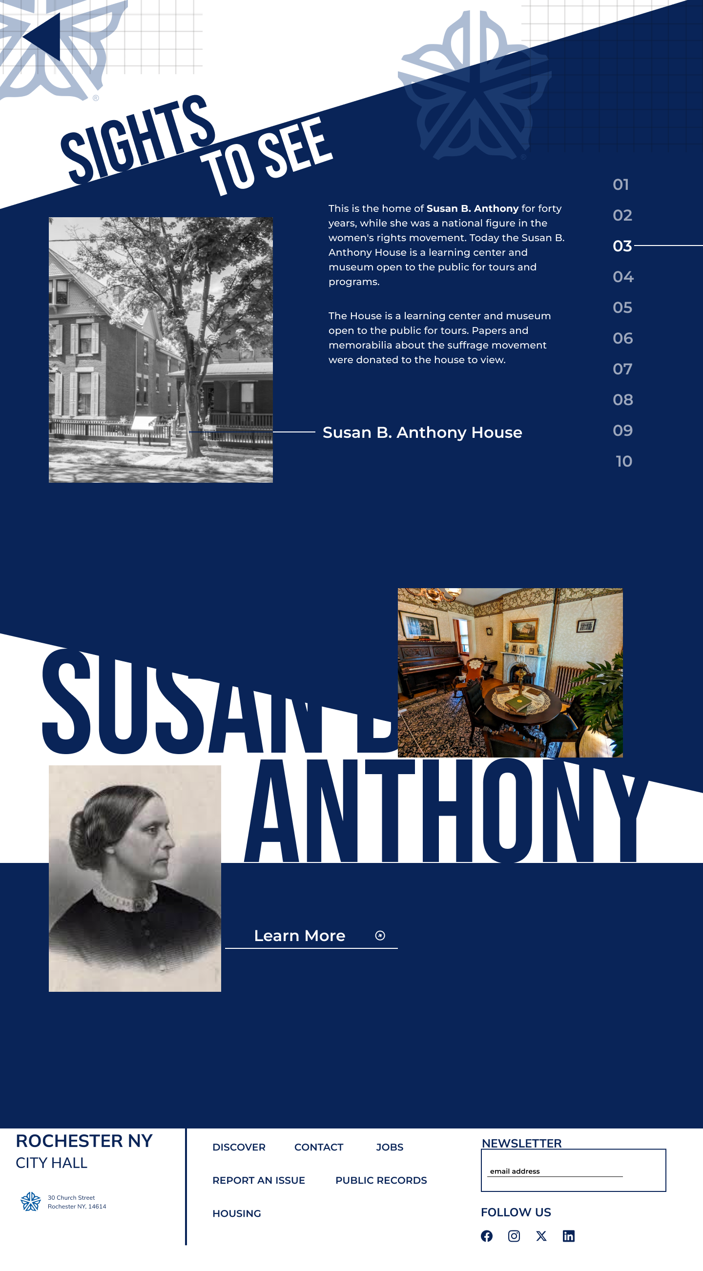
Final Screens
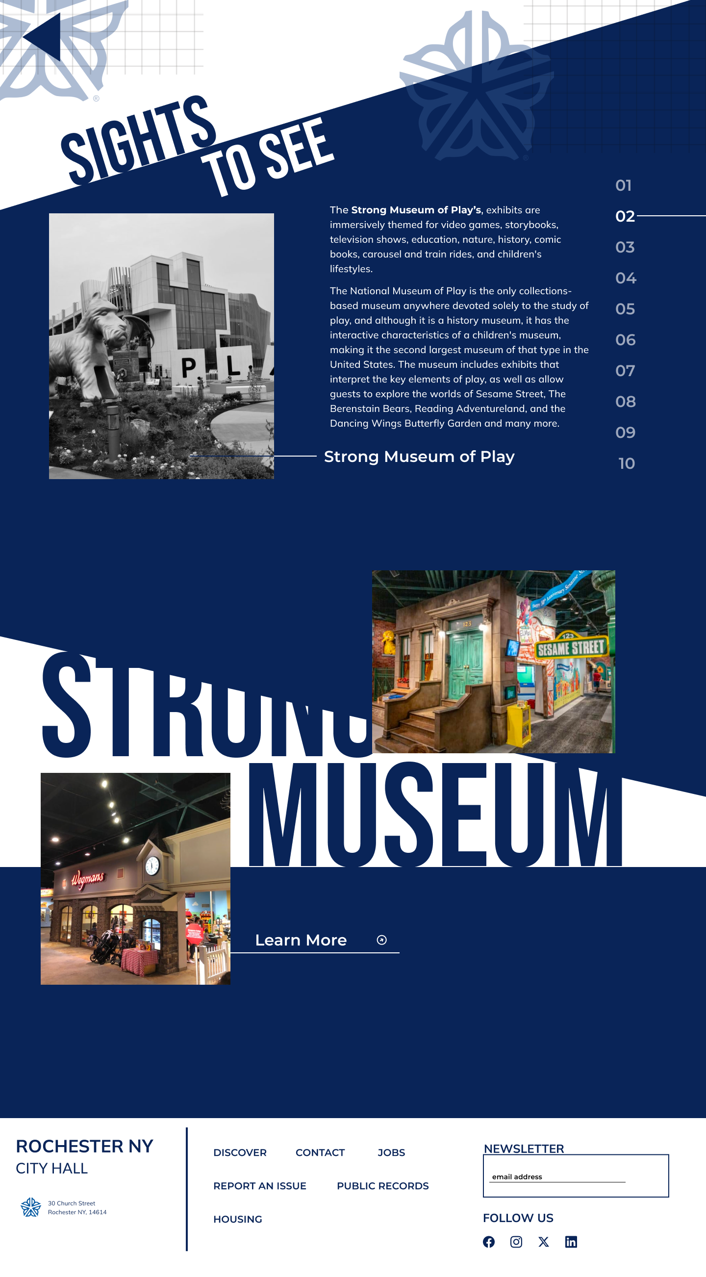
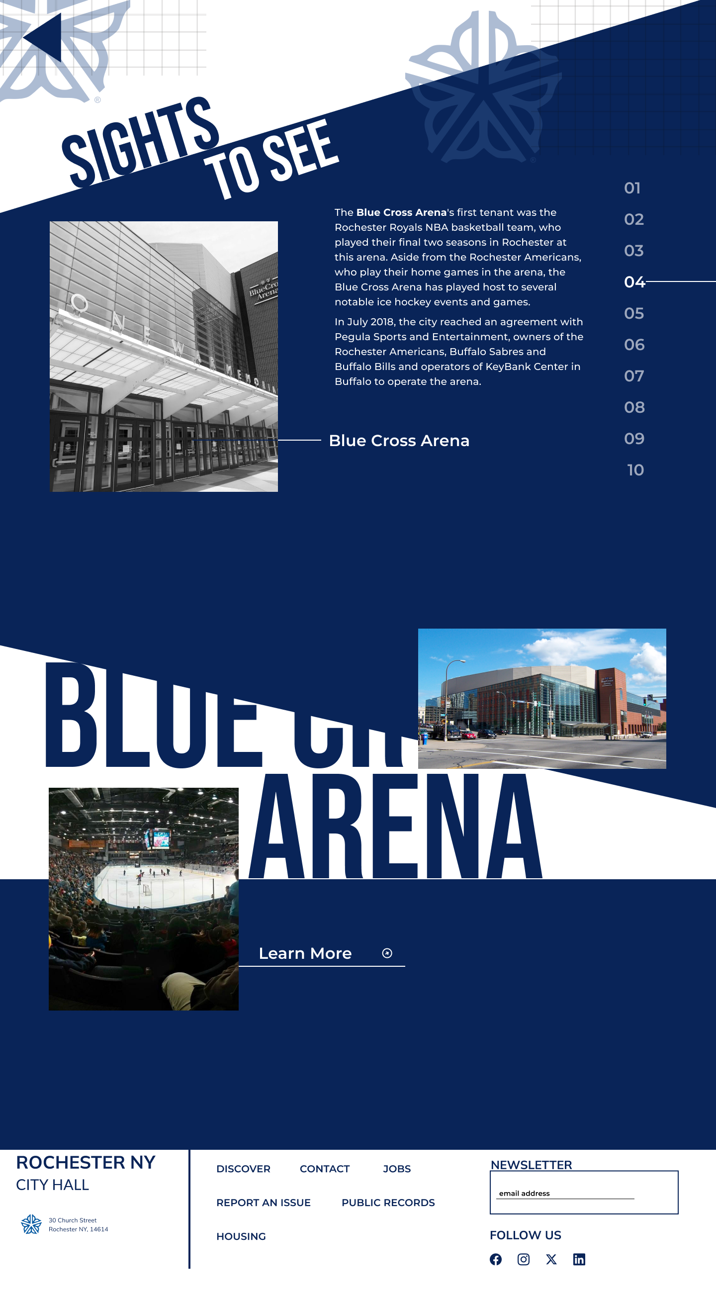
This redesign process taught me a lot. Through research, finding a user identify and multiple design iterations, I was able to develop and push a more creative design approach to this city website. I set a limited color palette to challenge myself and I was more experimental with the treatment of images, cards and graphics of each category. These elements were turned into a fun and unique website design with each iteration.


