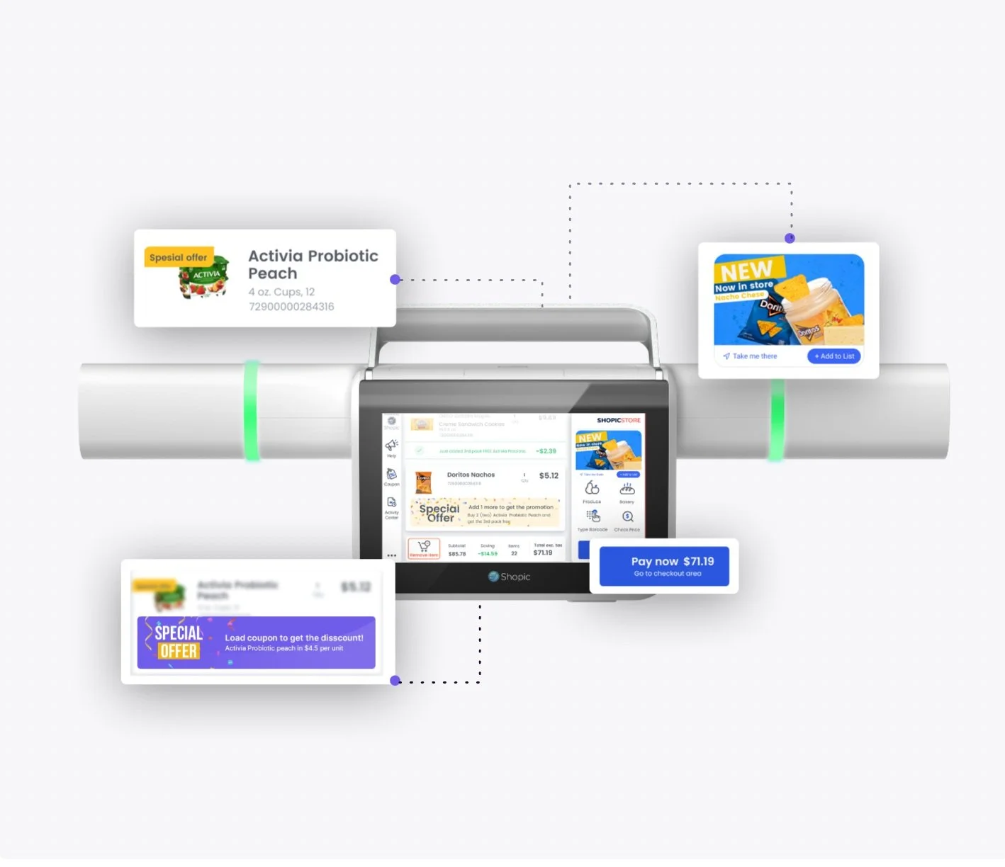
The problem at hand…
The Wegmans Shopic Smart Cart is currently in its testing phase at the Pittsford, NY store, offering a unique opportunity to assess its UX/UI effectiveness.
This case study aims to evaluate the existing user experience, identify pain points, and propose a redesign to improve usability and functionality.
User Experience Designer
Intern/Co-op
Year 2024- 2025
June ‘24- Present
Software: Figma
Key areas of focus include:
User Interaction: How intuitive the interface is for shoppers, from scanning items to final checkout.
Navigation & Display: The clarity of the screen layout, touch responsiveness, and information hierarchy.
Performance & Reliability: Responsiveness, scanning accuracy, and any technical limitations.
Shopper Behavior & Adoption: Observing how customers engage with the cart and any friction points in usage.
With these insights, my redesign aims to enhance the shopping experience, improve ease of use, and integrate better with Wegmans' overall digital shopping experience.
The Current Experience | Areas for Improvement
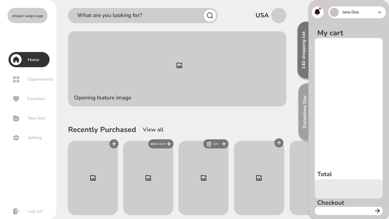
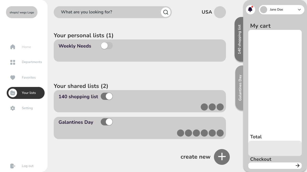
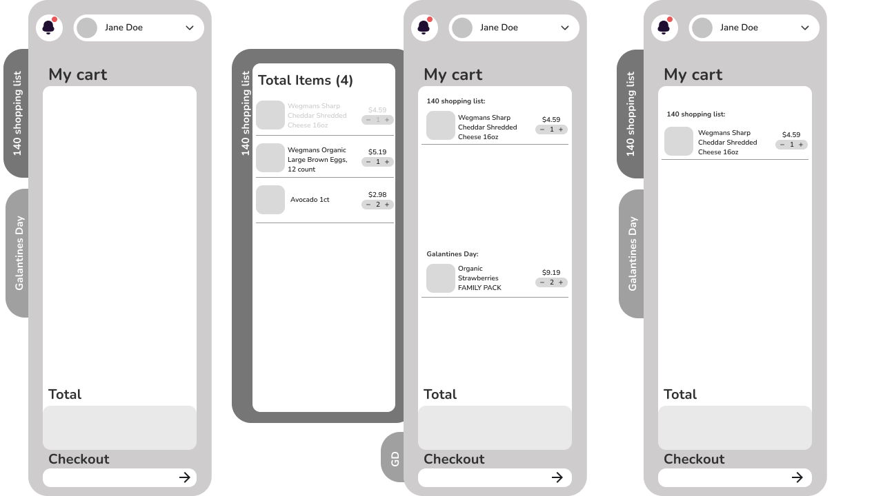
Wireframes
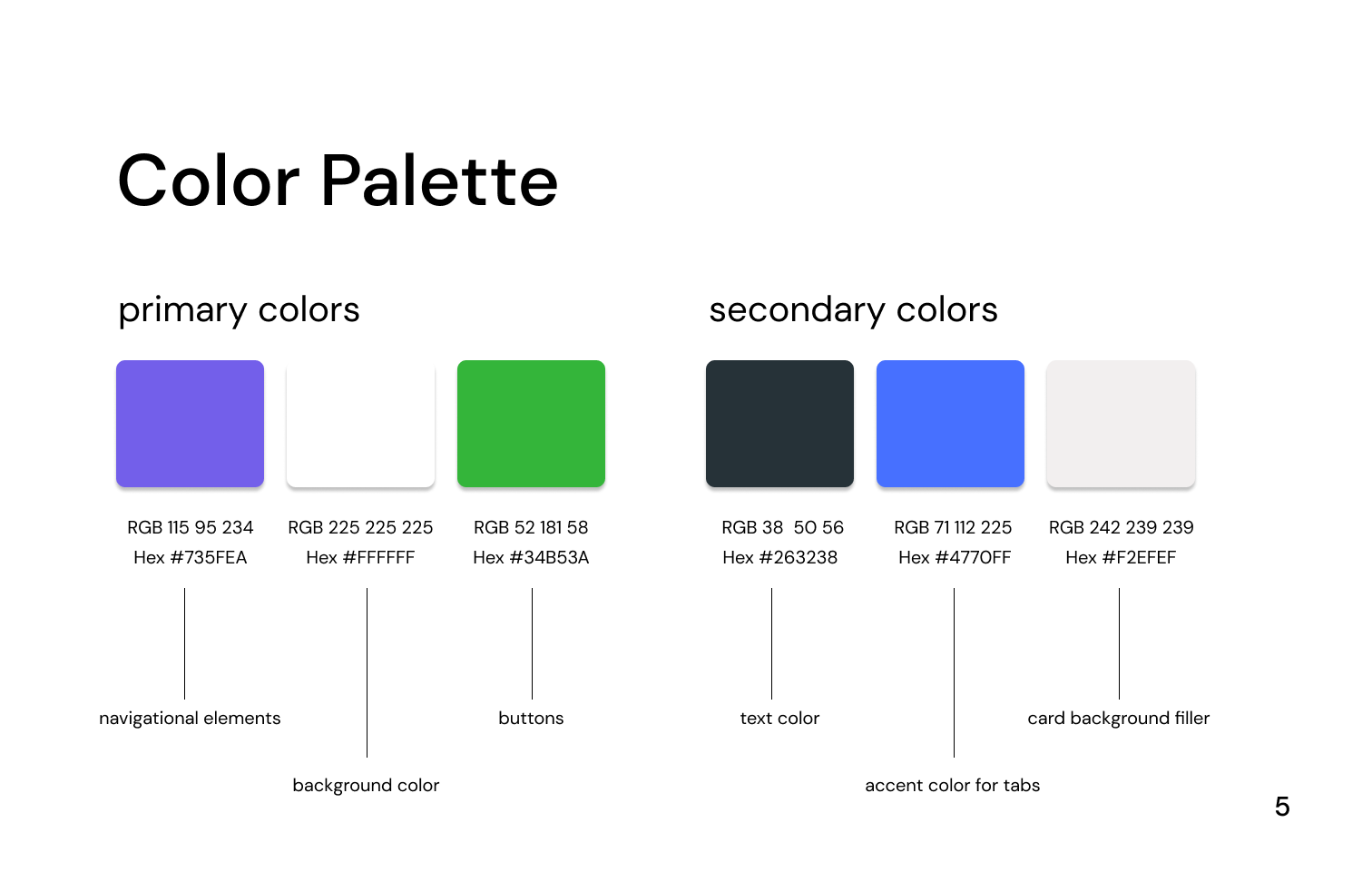
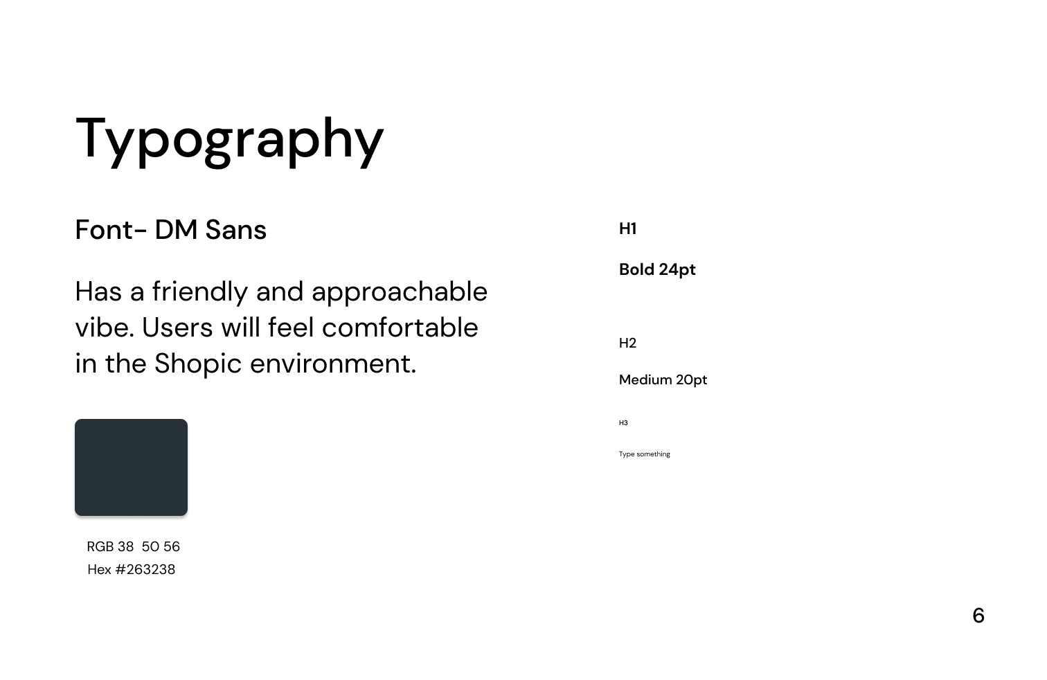
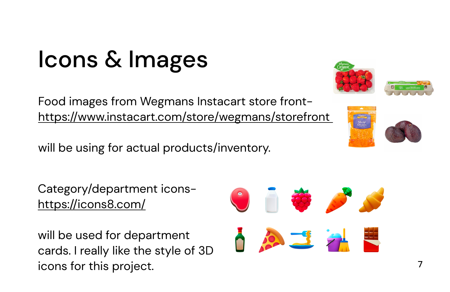
Style Guide
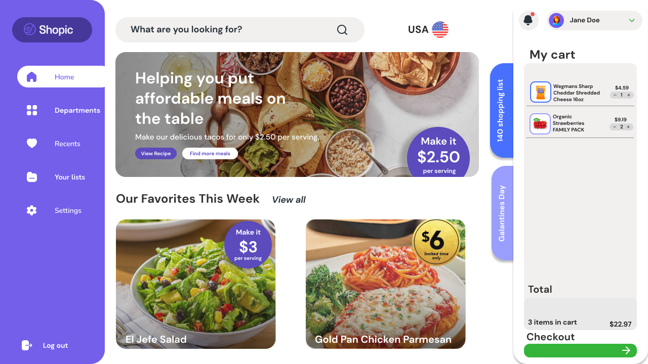
Final Screens
Prototype
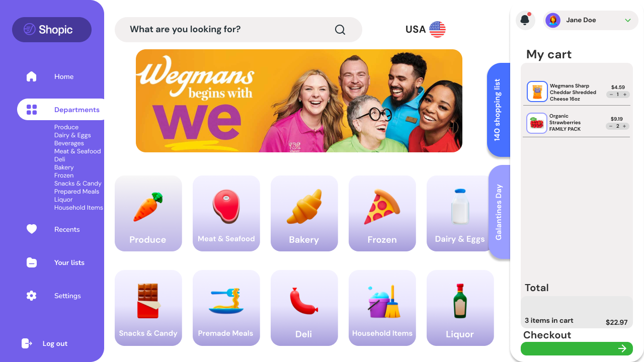
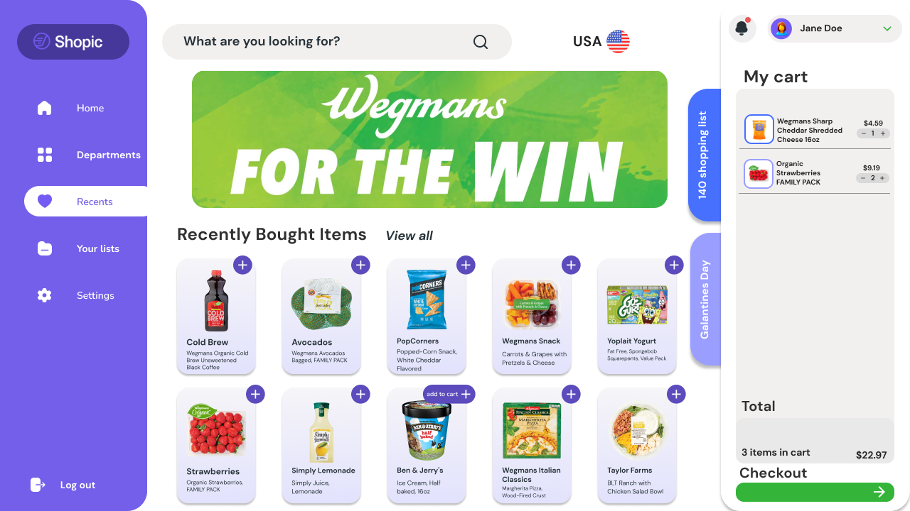
The four main pathways available from the Home Screen, which can be accessed via the sticky menu, include the following options:
Departments
Favorites
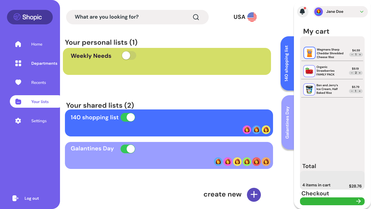
Shopping Lists.
The redesign’s primary focus is centered around enhancing the functionality and user experience of the Shared Shopping Lists feature!
View Process Document:
Throughout the implementation of the smart cart functionality, the project taught me the importance of embracing continuous improvement. By consistently seeking opportunities to refine and enhance the user experience, the smart cart evolved from its initial concept into a more effective and customer-centric solution.


